디즈니플러스 사이트 레이아웃
✒️ 2025-05-16 13:04 내용 수정
실습 목표
- 디즈니 플러스 사이트의 레이아웃과 효과를 보고 CSS로 구현해본다.
- disney plus
- 사이트 실습에 사용한 글자들은 모두 디즈니플러스 사이트의 정보다.
- 글과 이미지 모두 레이아웃 실습 용도로만 사용했다.
실습 흐름
- 사이트의 레이아웃 구조에 맞게 HTML을 작성한다.
- 각 section별 세부적인 CSS를 작성하여 기능을 구현한다.
파트별 코드
header
- html
    <header class="header">
      <nav class="nav">
        <ul class="nav-list">
          <li class="nav-item">
            <a href="#">
              <span>로그인</span>
            </a>
          </li>
        </ul>
      </nav>
    </header>
- css
.header{width: 100%; margin: 0 auto; padding: 0 5vw;}
.header .nav{display: flex; justify-content: flex-end;}
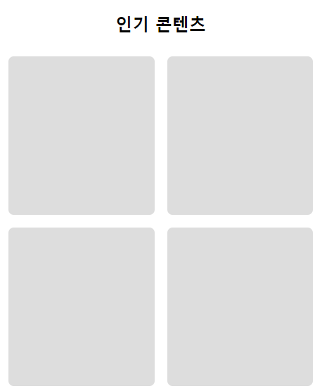
section 1
- html
      <section class="con1 content">
        <div class="title-wrap">
          <h2 class="title">인기 콘텐츠</h2>
        </div>
        <ul class="item-wrap">
          <li class="item"></li>
          <li class="item"></li>
          <li class="item"></li>
          <li class="item"></li>
          <li class="item"></li>
          <li class="item"></li>
          <li class="item"></li>
          <li class="item"></li>
          <li class="item"></li>
        </ul>
      </section>
- css
/* main 공통 */
main{width: 100%; margin: 0 auto;}

.content{width: 100%; padding: 5vw;}
.content .title-wrap{margin: 0 0 40px;}
.content .title-wrap .title{font-size: 32px; text-align: center; margin: 0 0 20px;}
.content .item-wrap{
    width: 100%; display: flex;
    justify-content: space-between; flex-wrap: wrap;
}

/* content 1 */
.con1 .item-wrap .item{
    width: calc((100% - 60px) / 3); height: 300px; margin: 0 0 30px; background-color: #ddd;
    border-radius: 10px;
}

/* 미디어 쿼리 - 박스 사이즈 변경 */
@media screen and (max-width:1024px) {
    .con1 .item-wrap .item{width: calc((100% - 48px) / 3); margin: 0 0 24px;}
}

@media screen and (max-width:768px) {
    .con1 .item-wrap .item{width: calc((100% - 24px) / 2);}
}
section 2
- html
<section class="con2 content">
<ul class="item-wrap">
<li class="item">
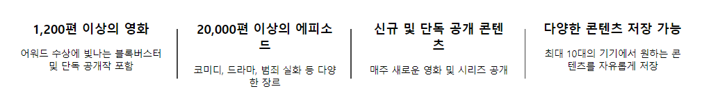
<h3>1,200편 이상의 영화</h3>
<p>어워드 수상에 빛나는 블록버스터 및 단독 공개작 포함</p>
</li>
<li class="item">
<h3>20,000편 이상의 에피소드</h3>
<p>코미디, 드라마, 범죄 실화 등 다양한 장르</p>
</li>
<li class="item">
<h3>신규 및 단독 공개 콘텐츠</h3>
<p>매주 새로운 영화 및 시리즈 공개</p>
</li>
<li class="item">
<h3>다양한 콘텐츠 저장 가능</h3>
<p>최대 10대의 기기에서 원하는 콘텐츠를 자유롭게 저장</p>
</li>
</ul>
</section>
- css
- 각 박스 사이에 구분형 바 추가하기
/* main 공통 */
main{width: 100%; margin: 0 auto;}

.content{width: 100%; padding: 5vw;}
.content .title-wrap{margin: 0 0 40px;}
.content .title-wrap .title{font-size: 32px; text-align: center; margin: 0 0 20px;}
.content .item-wrap{
    width: 100%; display: flex;
    justify-content: space-between; flex-wrap: wrap;
}

/* content 2 */
.con2 .item-wrap .item{width: 25%; text-align: center; padding: 30px; position: relative;}
/* border-right: 1px solid #444; --> 참고 웹사이트에선 사용x */
/* .con2 .item-wrap .item:last-of-type{border: 0;} */
/* 가상 요소 적용 */
.con2 .item-wrap .item::after{
    content: ''; display: block;
    width: 2px; height: 50%;
    position: absolute; right: 0; top:25%;
    background-color: #444;
}
.con2 .item-wrap .item:last-of-type::after{display: none;}

.con2 .item-wrap .item h3{font-size: 24px; margin : 0 0 20px;}
.con2 .item-wrap .item p{font-size: 18px;}

/* 미디어 쿼리 */
@media screen and (max-width:768px) {
    /* item 4개 -> 1개 : 너비를 변경하여 개수 제한 */
    .con2 .item-wrap{justify-content: center;}
    .con2 .item-wrap .item{width: 100%; max-width: 400px;}

    /* .con2 .item-wrap .item::after 오른쪽 -> 가운데 아래 배치
        너비 : 50%, 높이 : 1px 변경
    */

    /* 1) after를 변경 */
    .con2 .item-wrap .item::after{
        width: 50%; height: 2px;
        right: 25%; top: 100%;
    }

    /* 2) before를 추가하고 after를 안보이게 설정 */
    /* .con2 .item-wrap .item::after{display: none;} */
    /* .con2 .item-wrap .item::before{
        content: ''; display: block;
        width: 50%; height: 1px;
        position: absolute; right: 25%; bottom:0;
        background-color: #444;
    }
    .con2 .item-wrap .item:last-of-type::before{display: none;}
    */
}
section 3
- html
<section class="con3 content">
<div class="title-wrap">
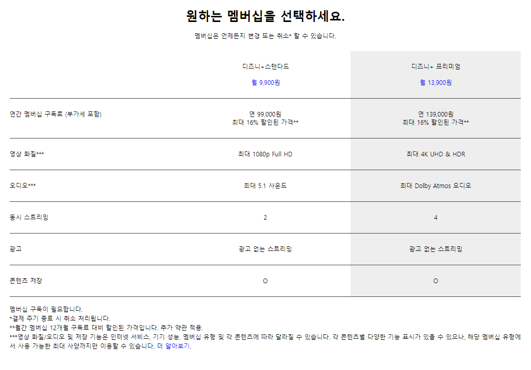
<h2 class="title">원하는 멤버십을 선택하세요.</h2>
<p>멤버십은 언제든지 변경 또는 취소* 할 수 있습니다.</p>
</div>
<div class="info-wrap">
<div class="info-table">
<div class="info-title">
<div class="info-title-cell second">
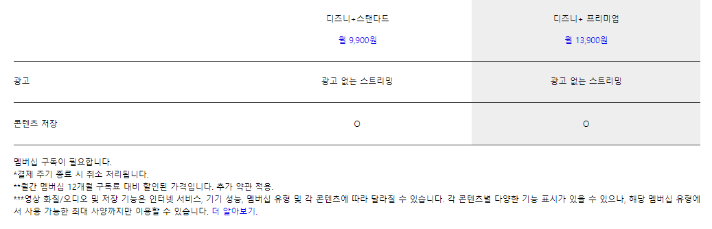
<p>디즈니+스탠다드</p>
<a href="#">월 9,900원</a>
</div>
<div class="info-title-cell third">
<p>디즈니+ 프리미엄</p>
<a href="#">월 13,900원</a>
</div>
</div>
<div class="info-content cell-1">
<div class="info-cell first">
연간 멤버십 구독료 (부가세 포함)
</div>
<div class="info-cell second">
<p>연 99,000원</p>
<p>최대 16% 할인된 가격**</p>
</div>
<div class="info-cell third">
<p>연 139,000원</p>
<p>최대 16% 할인된 가격**</p>
</div>
</div>
<div class="info-content cell-2">
<div class="info-cell first">영상 화질***</div>
<div class="info-cell second">최대 1080p Full HD</div>
<div class="info-cell third">최대 4K UHD & HDR</div>
</div>
<div class="info-content cell-3">
<div class="info-cell first">오디오***</div>
<div class="info-cell second">최대 5.1 사운드</div>
<div class="info-cell third">최대 Dolby Atmos 오디오</div>
</div>
<div class="info-content cell-4">
<div class="info-cell first">동시 스트리밍</div>
<div class="info-cell second">2</div>
<div class="info-cell third">4</div>
</div>
<div class="info-content cell-5">
<div class="info-cell first">광고</div>
<div class="info-cell second">광고 없는 스트리밍</div>
<div class="info-cell third">광고 없는 스트리밍</div>
</div>
<div class="info-content cell-6">
<div class="info-cell first">콘텐츠 저장</div>
<div class="info-cell second">O</div>
<div class="info-cell third">O</div>
</div>
</div>
<div class="info-footer">
<p>
<span>멤버십 구독이 필요합니다.</span>
<span>*결제 주기 종료 시 취소 처리됩니다.</span>
<span
>**월간 멤버십 12개월 구독료 대비 할인된 가격입니다. 추가 약관
적용.</span
>
<span
>***영상 화질/오디오 및 저장 기능은 인터넷 서비스, 기기 성능,
멤버십 유형 및 각 콘텐츠에 따라 달라질 수 있습니다. 각 콘텐츠별
다양한 기능 표시가 있을 수 있으나, 해당 멤버십 유형에서 사용
가능한 최대 사양까지만 이용할 수 있습니다.
<a href="#">더 알아보기.</a></span
>
</p>
</div>
</div>
</section>
- css
- div를 사용해서 표 형태 만들기
- 스크롤바가 움직여도 같이 따라오는 효과 추가하기
/* main 공통 */
main{width: 100%; margin: 0 auto;}

.content{width: 100%; padding: 5vw;}
.content .title-wrap{margin: 0 0 40px;}
.content .title-wrap .title{font-size: 32px; text-align: center; margin: 0 0 20px;}
.content .item-wrap{
    width: 100%; display: flex;
    justify-content: space-between; flex-wrap: wrap;
}

/* content 3 */
.con3 .title-wrap{text-align: center; margin: 0 0 30px; }

.con3 .info-wrap{}

.con3 .info-wrap .info-title{
    display:flex; justify-content: flex-end;
    border-bottom: 1px solid #444;
    position: sticky; top:0;
    background-color: white;
}

.con3 .info-wrap .info-title .info-title-cell{
    text-align: center; width: 33.3333%; margin: -1px 0 0 -1px; padding: 30px 0;
}
.con3 .info-wrap .info-title .info-title-cell p{margin-bottom: 20px;}

.con3 .info-wrap .info-content{
    display:flex; justify-content: flex-end; flex-wrap: wrap; border-bottom: 1px solid #444;
}
.con3 .info-wrap .info-cell{ width: 33.3333%; padding: 30px 0;}

.con3 .info-wrap .first{text-align: left;}
.con3 .info-wrap .second{text-align: center;}
.con3 .info-wrap .third{text-align: center; background-color: #eee;}

.con3 .info-wrap .info-footer{margin-top: 20px;}
.con3 .info-wrap .info-footer p span{text-align: left; line-height: 1.5; display: block;}

@media screen and (max-width:768px) {
    .con3 .info-wrap .info-title .info-title-cell{width: 50%;}

    .con3 .info-wrap .info-content .info-cell{width: 50%;}
    .con3 .info-wrap .info-content .info-cell.first{width: 100%; text-align: center;}
    .con3 .info-wrap .third{background-color: transparent;}

    .con3 .info-wrap .info-footer p span{text-align: center;}
}
section 4
- html
      <section class="con4 content">
        <div class="item-wrap">
          <div class="item info">
            <h2 class="title">
              취향에 따라 골라보는 다양한 콘텐츠가 모두 한자리에
            </h2>
            <p class="txt">
              디즈니+는 디즈니, 픽사, 마블, 스타워즈, 내셔널지오그래픽, Star의
              최고 콘텐츠들을 모두 한곳에 모아 제공합니다.
            </p>
          </div>
          <div class="item pic"></div>
        </div>
      </section>
- css
/* main 공통 */
main{width: 100%; margin: 0 auto;}

.content{width: 100%; padding: 5vw;}
.content .title-wrap{margin: 0 0 40px;}
.content .title-wrap .title{font-size: 32px; text-align: center; margin: 0 0 20px;}
.content .item-wrap{
    width: 100%; display: flex;
    justify-content: space-between; flex-wrap: wrap;
}

/* content 4 */
.con4 .item-wrap{align-items: center;}
.con4 .item{width: 50%;}

.con4 .info{
    padding:0 18px; height: 50%;
    display: flex; flex-direction: row; flex-wrap: wrap; justify-content: center; }
.con4 .item h2{font: bold 36px 'inherit'; margin: 0 0 20px;}
.con4 .item p{font-size: 24px;}

.con4 .item.pic{height: 300px; background-color: pink;}

@media screen and (max-width:1200px) {
    .con4 .item h2{font-size: 28px;}
    .con4 .item p{font-size: 18px;}
}

@media screen and (max-width:768px) {
    .con4 .item{width: 100%; text-align: center;}
    .con4 .item.pic{margin: 10px;}
}
section 5
- html
      <section class="con5 content">
        <div class="title-wrap">
          <h2 class="title">디즈니+ 오리지널과 블록버스터 영화</h2>
          <p>
            다른 어디에서도 볼 수 없는 디즈니+ 오리지널을 만나보세요. 디즈니,
            픽사, 마블, 스타워즈의 최고 인기 영화도 마음껏 즐길 수 있습니다.
          </p>
        </div>
        <ul class="item-wrap">
          <li class="item"></li>
          <li class="item"></li>
          <li class="item"></li>
          <li class="item"></li>
          <li class="item"></li>
          <li class="item"></li>
          <li class="item"></li>
          <li class="item"></li>
          <li class="item"></li>
        </ul>
      </section>
- css
/* main 공통 */
main{width: 100%; margin: 0 auto;}

.content{width: 100%; padding: 5vw;}
.content .title-wrap{margin: 0 0 40px;}
.content .title-wrap .title{font-size: 32px; text-align: center; margin: 0 0 20px;}
.content .item-wrap{
    width: 100%; display: flex;
    justify-content: space-between; flex-wrap: wrap;
}

/* content 5 */
.con5 .item-wrap{
    width: 100%; display: flex;
    justify-content: space-between; flex-wrap: wrap;
}
.con5 .item-wrap .item{
    width:calc((100% - 60px) / 3); height: 300px;
    margin : 0 0 30px;
    background-color: #ddd;
    border-radius: 10px;
}

@media screen and (max-width:1024px) {
    .con5 .item-wrap .item{width:calc((100% - 48px) / 3); margin : 0 0 24px;}
}

@media screen and (max-width:768px) {
    .con5 .item-wrap .item{width:calc((100% - 24px) / 2); }
}
section 6
- html
<section class="con6 content">
<div class="title-wrap">
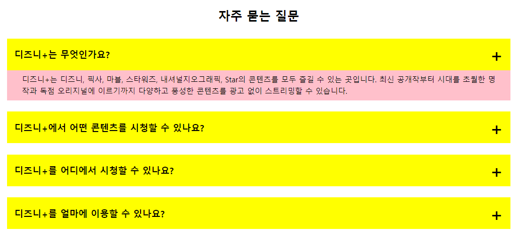
<h2 class="title">자주 묻는 질문</h2>
</div>
<ul class="question-list">
<li class="view">
<div class="question">
<span class="question-text">디즈니+는 무엇인가요?</span>
</div>
<div class="answer">
<p>
디즈니+는 디즈니, 픽사, 마블, 스타워즈, 내셔널지오그래픽, Star의
콘텐츠를 모두 즐길 수 있는 곳입니다. 최신 공개작부터 시대를
초월한 명작과 독점 오리지널에 이르기까지 다양하고 풍성한
콘텐츠를 광고 없이 스트리밍할 수 있습니다.
</p>
</div>
</li>
<li class="view">
<div class="question">
<span class="question-text">디즈니+에서 어떤 콘텐츠를 시청할 수 있나요?</span>
</div>
<div class="answer">
<p>디즈니+는 새로운 콘텐츠를 계속해서 추가하고 있습니다.</p>
<ul>
<li>최신 공개작과 시대를 초월한 명작</li>
<li>독점 공개하는 새로운 오리지널 영화와 시리즈</li>
<li>흥미진진한 스페셜과 기간 한정 스트리밍되는 특별 콘텐츠</li>
<li>
그때 그 시절 추억의 작품과 인기 시리즈의 지난 시즌 에피소드
</li>
<li>
스카이워커 사가 전체와 대부분의 마블 시네마틱 유니버스 작품
</li>
<li>인기 단편과 실험적인 단편</li>
<li>다큐멘터리, 리얼리티 시리즈 등</li>
</ul>
</div>
</li>
<li class="view">
<div class="question">
<span class="question-text">디즈니+를 어디에서 시청할 수 있나요?</span>
</div>
<div class="answer">
<p>
디즈니+ 앱은 모바일 기기, 웹 브라우저, 게임 콘솔, 셋톱박스,
스마트 TV에서 이용할 수 있습니다. 지원되는 기기의 전체 목록을
보려면 <a href="#">여기를 클릭</a>하세요.
</p>
</div>
</li>
<li class="view">
<div class="question">
<span class="question-text">디즈니+를 얼마에 이용할 수 있나요?</span>
</div>
<div class="answer">
<p>디즈니+ 스탠다드(부가세 포함): 월 9,900원 / 연 99,000원</p>
<p>디즈니+ 프리미엄(부가세 포함): 월 13,900원 / 연 139,000원</p>
</div>
</li>
</ul>
</section>
- css
/* main 공통 */
main{width: 100%; margin: 0 auto;}

.content{width: 100%; padding: 5vw;}
.content .title-wrap{margin: 0 0 40px;}
.content .title-wrap .title{font-size: 32px; text-align: center; margin: 0 0 20px;}
.content .item-wrap{
    width: 100%; display: flex;
    justify-content: space-between; flex-wrap: wrap;
}

/* content 6 */
.con6 .question-list{width: 100%;}
.con6 .question-list > li{width: 100%; margin: 0 0 30px;}
.con6 .question-list > li .question{
    padding: 10px 20px; background-color: yellow; font: bold 24px 'inherit';
    display: flex; flex-direction: row; justify-content: space-between; align-items: center;
}
.con6 .question-list > li .question::after{content:'+'; font-size: 48px;}

.con6 .question-list > li .answer{
    width: 100%; max-height: 0; overflow: hidden;
    padding: 0 30px; margin-bottom: 30px;
    background-color: pink; font-size: 20px; line-height: 1.5;
    transition: 0.3s;
}

.con6 .question-list > li .answer p{margin: 10px;}
.con6 .question-list > li .answer ul{padding:0 0 0 40px; margin: 0 0 10px;}
.con6 .question-list > li .answer li{list-style: disc; line-height: 2;}
/* .con6 .question-list > li.view .answer{max-height: 100%;} */

@media screen and (max-width:768px) {
    .con6 .question-list > li .question{font-size: 20px;}
    .con6 .question-list > li .answer{font-size: 16px;}
}
- javascript
- 버튼을 누르면 컨텐츠가 보이는 효과 추가하기
let question = document.getElementsByClassName("question");

for (let i = 0; i < question.length; i++) {
  question[i].addEventListener("click", function () {
    let answer = this.nextElementSibling;
    menuOpen(question[i], answer);
    menuClose(question, answer);
  });
}

// style.maxHeight = '0' <-> style.maxHeight = '100%' 로 하면
// transition에 값을 추가했을 때 오히려 버벅인다.
// style.maxHeight = null <-> style.maxHeight = scrollHeight + 'px'; 사용

function menuClose(question, answer) {
  for (let j = 0; j < question.length; j++) {
    if (question[j].nextElementSibling != answer) {
      question[j].nextElementSibling.style.maxHeight = null;
    }
  }
}

function menuOpen(question, answer) {
  // let plus = window.getComputedStyle(question, '::after');

  if (answer.style.maxHeight) {
    answer.style.maxHeight = null;
    // plus.content.replace("-", "+");
  } else {
    answer.style.maxHeight = answer.scrollHeight + "px";
    // plus.content.replace("+", "-");
  }
}
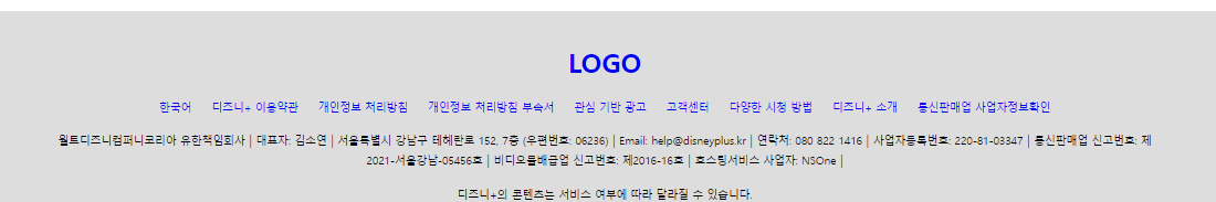
footer
- html
    <footer class="footer">
      <h1 class="logo"><a href="#">LOGO</a></h1>
      <nav class="menu">
        <ul class="list">
          <li><a href="#">한국어</a></li>
          <li><a href="#">디즈니+ 이용약관</a></li>
          <li><a href="#">개인정보 처리방침</a></li>
          <li><a href="#">개인정보 처리방침 부속서</a></li>
          <li><a href="#">관심 기반 광고</a></li>
          <li><a href="#">고객센터</a></li>
          <li><a href="#">다양한 시청 방법</a></li>
          <li><a href="#">디즈니+ 소개</a></li>
          <li><a href="#">통신판매업 사업자정보확인</a></li>
        </ul>
      </nav>
      <div class="info">
        <p>
          <span>월트디즈니컴퍼니코리아 유한책임회사</span>
          <span>대표자: 김소연</span>
          <span>서울특별시 강남구 테헤란로 152, 7층 (우편번호: 06236)</span>
          <span>Email: help@disneyplus.kr</span>
          <span>연락처: 080 822 1416</span>
          <span>사업자등록번호: 220-81-03347</span>
          <span>통신판매업 신고번호: 제2021-서울강남-05456호</span>
          <span>비디오물배급업 신고번호: 제2016-16호</span>
          <span>호스팅서비스 사업자: NSOne</span>
        </p>
        <p>
          <span>디즈니+의 콘텐츠는 서비스 여부에 따라 달라질 수 있습니다.</span>
          <span
            >© 2023 Disney and its related entities. All Rights Reserved.</span
          >
        </p>
      </div>
    </footer>
- css
- ul 내의 li 항목들을 가로로 배치하기
- 글자 사이에 구분 바 추가하기
.footer{
    width: 100%; margin: 0 auto; padding: 40px 5vw; background-color: #ddd;
    display: flex; flex-direction: column; align-items: center;
}
.footer .logo{}
.footer .menu{}
.footer .menu .list{
    margin: 20px 0;
    display: flex; justify-content: center; flex-wrap: wrap;
}
.footer .menu .list li a{padding: 10px 12px; font-size: 13px;}

.footer .info {display: flex; justify-content: center; flex-wrap: wrap;}
.footer .info p{text-align: center; margin: 0 0 20px;}
.footer .info p span{font-size: 13px; font-weight: normal; font-style: normal;line-height: 1.5;}
.footer .info p:first-of-type span::after{content: ' | '; font-size: 14px;}
.footer .info p:last-of-type span{display: block;}